Lucy Swan is the News Graphics Editor at The Guardian in London, where she leads a small team of five talented graphic artists and a graphics editor. Together, they create informative visuals that explain breaking news - in an impossibly small amount of time
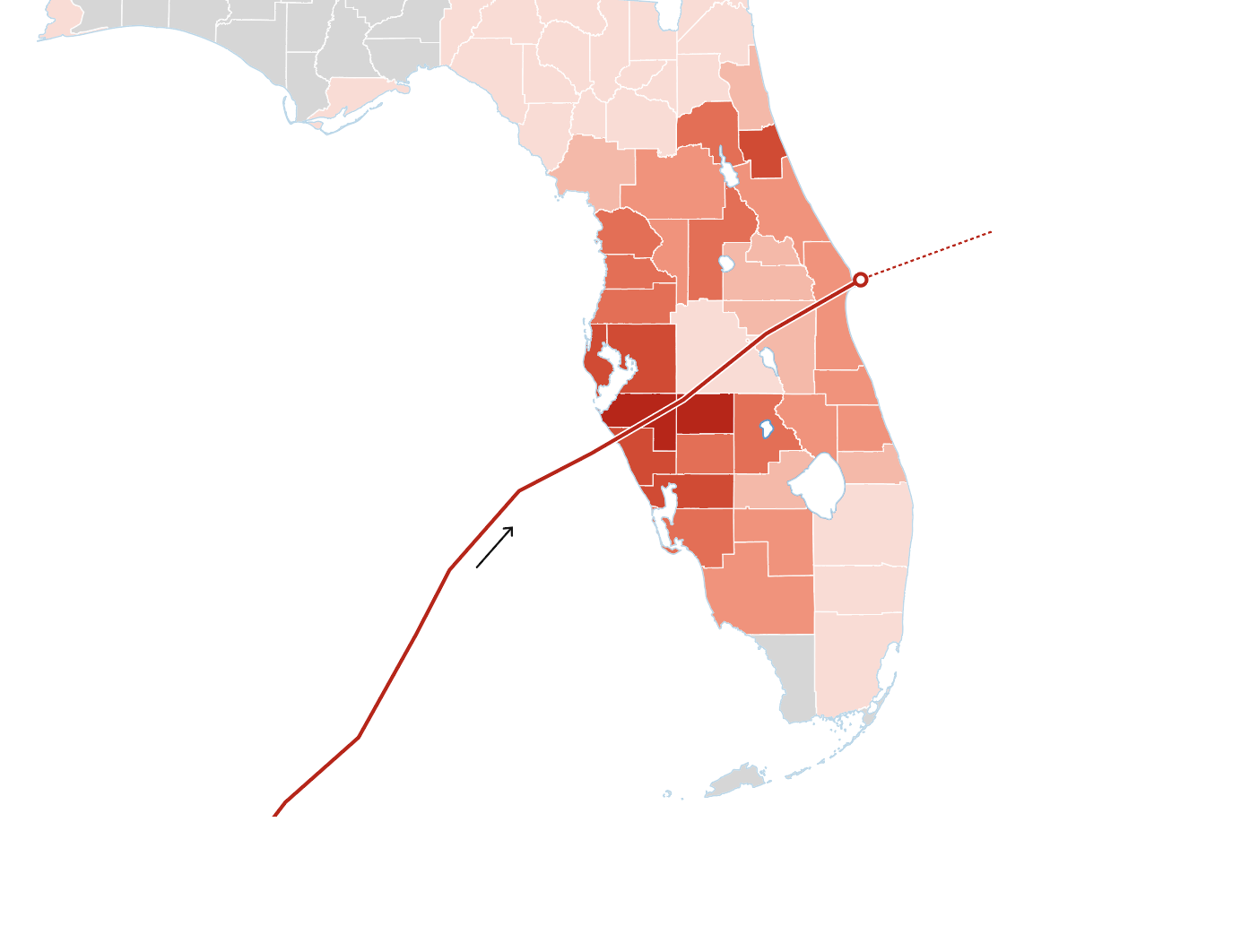
A visual guide to the damage caused by Hurricane Milton
Charts, maps and diagrams catalog the impact of Milton, and explain how warmer seas super-charge hurricanes
The Guardian 10 Oct 24
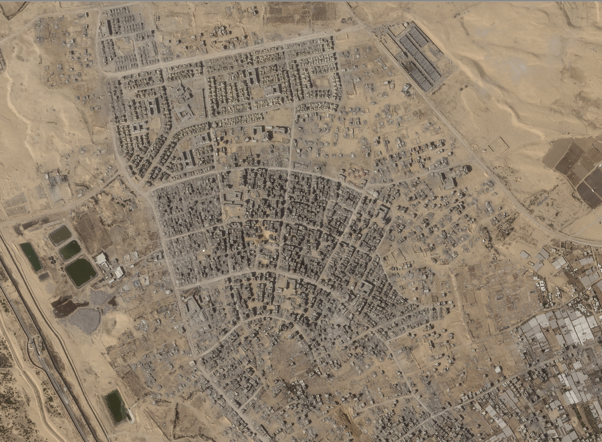
How a year of war laid waste the Gaza Strip – visualised
A visual analysis of Planet satellite imagery reveals the decimation of Rafah, a former “safe city” and red line
The Guardian 13 Oct 24
What the data tells us about the 2024 UK rioters
Geospatial analysis challenges the widely circulated notion of the out-of-town rioter following the far-right riots in the UK
The Guardian 25 Sep 24
How England’s national parks failed nature – and how to fix them
The phenomenon of “access islands” in England’s National Parks is mapped using Defra data on public access rights
The Guardian 13 Sep 24
How the maelstrom under Greenland’s glaciers could slow future sea level rise
Sentinel 2 satellite imagery and illustrations explain how sediment banks might slow the pace of glacial melt
The Guardian 6 Sep 24
Can climate stripes change the way we think about air pollution?
A fascinating data and visual treatment from the Air Quality Stripes project demonstrates how air quality trends can be reversed
The Guardian 23 Aug 24
The broken years: How Tory neglect flooded Britain’s rivers with sewage
Maps of the Thames show how river companies pump sewage into the river from source to estuary
The Guardian 25 Jun 24
‘Man-made starvation’: the obstacles to Gaza aid deliveries – visual guide
Data and visuals illustrate how Israel has isolated Gaza, laying the foundations for the current humanitarian crisis
The Guardian 22 Mar 24
Elon Musk was once an environmental hero: is he still a rare green billionaire?
The 200 flights taken by Elon Musk’s private jet in one year visualised along with the associated emissions
The Guardian 20 Nov 23
Satellite images show destruction of northern Gaza
A visual analysis of satellite imagery of northern Gaza reveals over 1,000 craters visible from space
The Guardian 4 Nov 23
The hottest summer in human history – a visual timeline
Charts demonstrate the terrifying climate anomalies witnessed in the summer of 2023, between June and August
The Guardian 25 Jul 23
Accounting for the Cotton capital’s human cost
Historic census data show the presence of enslaved people in the expanding territory of the United States, from 1800 onwards
The Guardian 30 Mar 23
More than 90% of rainforest carbon offsets by biggest certifier are worthless
The flawed methodologies used by carbon offsetting companies to generate meaningless credits - visualised
The Guardian 18 Jan 23


